
University of Washington, for the Kuali Student consortium · 2010–2012
One course proposal for many universities
Designed course proposal for an open-source curriculum system built by a consortium of universities: one configurable form to replace paper and green-screen processes, and a hard lesson about designing for expert speed.
The problem
Kuali Student is an open-source student system that a group of universities built and maintain together. I worked on its curriculum management: how a new course is proposed, reviewed and approved, and how existing courses are changed.
Each university did this its own way. Some offices passed paper forms from desk to desk. Others, the University of Maryland among them, used a keyboard-driven green-screen terminal system. The goal was one modern, web-based process that every member university could use. TODO: one sentence on what the old process cost, e.g. how long a proposal took or where they got stuck.
Seven designers, four campuses
The UX team was spread across four universities in two countries. We met every day over Skype and reviewed each other’s work constantly. Each of us ran research on our own campus and brought it back to the group.
No two universities had the same culture or the same requirements. Our approach was to design around one university as the model, then make the result flexible enough to work for the others.
Constraints
We were designing on top of a pattern library and a component library that were still being built, and the component library was very limited. We cut designs back constantly. It couldn’t even open a modal window that sent a response back to the screen that launched it.
Without modals, everything had to happen on a single page, so a course proposal became one very long form.
The screens also had to be accessible. That was a compliance requirement for the member universities, and it turned out to matter more than we expected.
Research
We ran contextual inquiries and usability studies with the university administrators who handled course proposals. We also ran a focus group, which turned out to be more chaotic than useful. Watching people do their real work one at a time told us far more than a room full of opinions.
The 30-second green screen
The finding I remember best came from Maryland. An experienced administrator could complete a task on the green screen in about 30 seconds. The same task in our proposed interface, with its mouse clicks and tabbing, took between a minute and a minute and a half.
The green screen took time to learn, but once people knew it, they flew. They told us plainly that they would reject anything that slowed them down. For these users, a more modern interface was a step backward.
The design: one form, configured by university
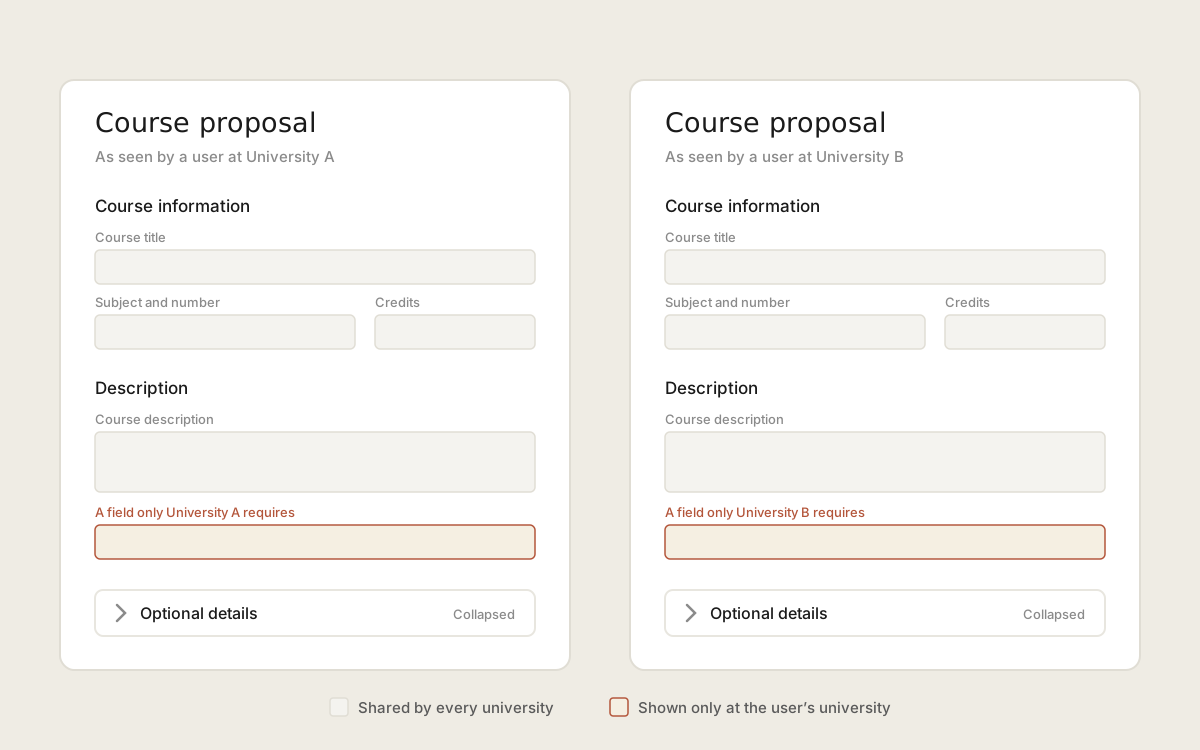
We built one form that covered the requirements of every participating university. Fields that only one university needed were shown to that university’s users and hidden from everyone else, so each person saw only what applied to them.
To keep the long single page manageable, we broke it into sections. Sections that held only optional fields collapsed and expanded, so the required path stayed as short as possible.
After the Maryland finding, we focused hard on making every screen work from the keyboard. Accessibility already required that, and it also served the fastest users best.
Outcome
Keyboard-friendly screens helped, but they didn’t close the gap. Select lists still meant tabbing through options one at a time, and the green screen stayed faster.
There was no plan to retire the green screens. I left the project in June 2012 and work continued after me, but my understanding is that administrators who knew the green screen kept using it. TODO: say what had shipped by June 2012, if you remember.
What I’d do differently
I’d measure the old system first and treat its speed as a target the new design has to beat. That 30-second task should have been a benchmark from the start, not a surprise partway through.
For expert users, I’d design for typing: type-ahead fields instead of select lists, and a keyboard path through the whole form. A system people already know how to fly through is the real competition, and a new design has to be faster than it, not just more modern.